

You must log in or # to comment.
“Neighborhoods and communities across the country will benefit from TEMPO’s game-changing data for decades to come,"
Not if politicians don’t give a damn.
I hadn’t heard anything about this. Thanks for posting!
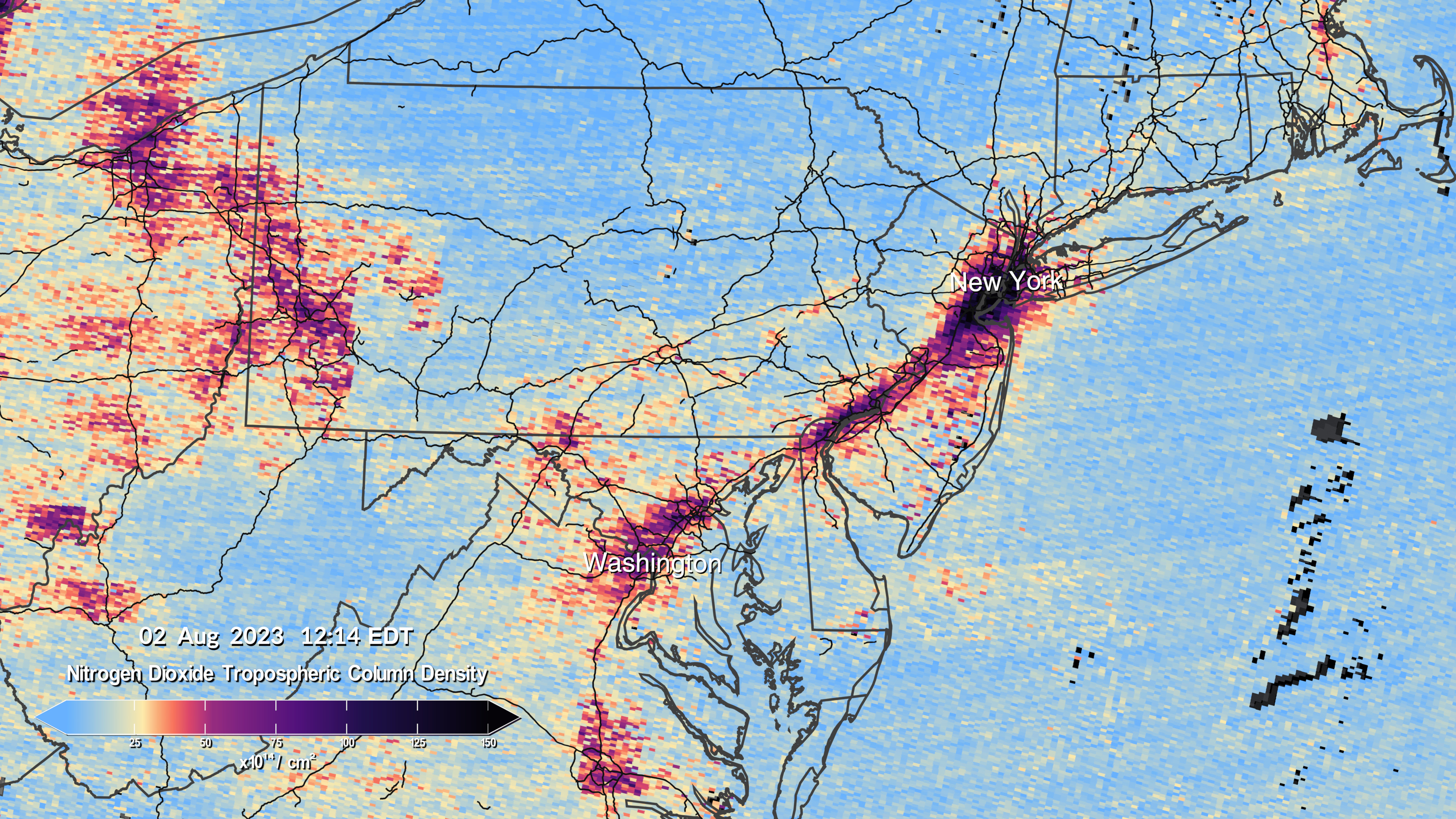
I saw a gray area where I live and wondered if somehow our pollution was low. Turns out that was just clouds. Different picture entirely when they moved.
Edit: changed great typo to gray
Not to be dismissive of the actual science, but this is basically a nearly 1:1 overlay of a population density map.
Does it? Los Angeles looks worse than New York City while having less than half the people. I imagine it’s going to correlate more with amount of cars and distance cars drive.