The update is available to all registered users part of the Apple Developer Program. Apple has released its second iOS 26 beta to developers, and the...
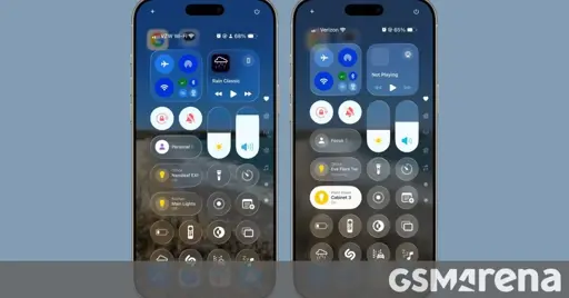
If everything got updated like this, then that’s an awesome change. What made Aero so nice was that it didn’t interfere with legibility, while Glass threw legibility out the window. Striving for a proper foreground to background contrast ratio should be the bare minimim for a company like Apple, and this improves that significantly.


If everything got updated like this, then that’s an awesome change. What made Aero so nice was that it didn’t interfere with legibility, while Glass threw legibility out the window. Striving for a proper foreground to background contrast ratio should be the bare minimim for a company like Apple, and this improves that significantly.