Love the “gas” label in your second picture. There was no need at all to tilt letters, but I guess it would not keep the theme of “thrown together” if it was straight text.
Also what is with all that background white in between the graphs? Is it electricity demand that didn’t get meet by any means?
Asking jokingly.

I read your comment before clicking on the article, and I thought “how bad could they be?”
These have me in tears… Lol
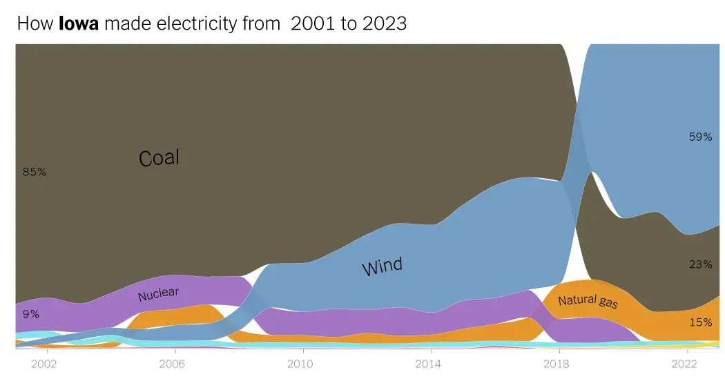
They are ugly, but they also tell an important story, which is the decline of coal, and (in some areas) rise of wind and solar.
Love the “gas” label in your second picture. There was no need at all to tilt letters, but I guess it would not keep the theme of “thrown together” if it was straight text.
Also what is with all that background white in between the graphs? Is it electricity demand that didn’t get meet by any means? Asking jokingly.
You’d think that 100% height graphs (or whatever they’re called) didn’t exist
I honestly can’t believe those are real graphs. Looks like Ms paint and that Amiga 500 program had a baby that was dropped on his head