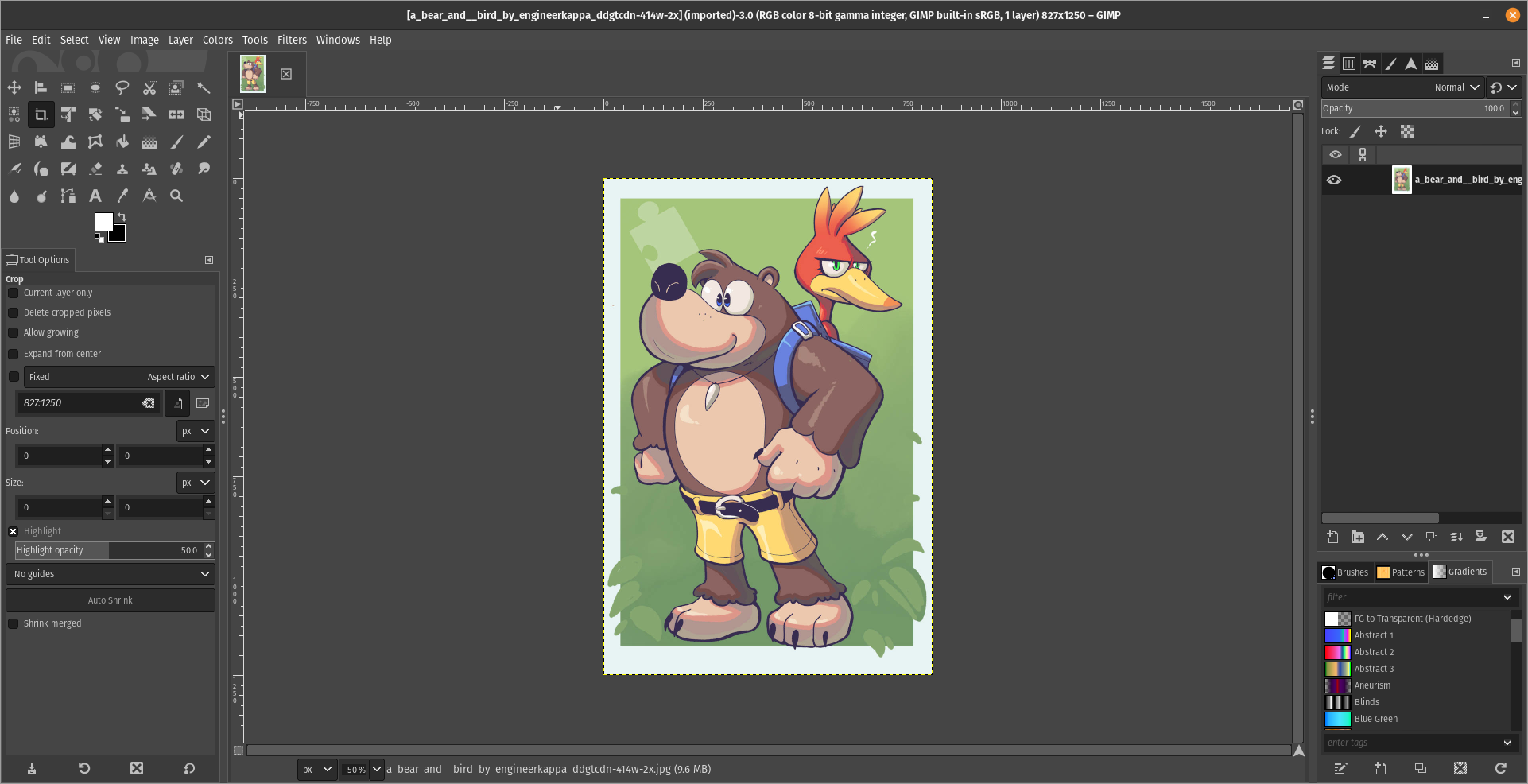
For what i heard, a lot of people on the Linux community use Krita for image manipulation, even though, it’s intended for digital painting, and GIMP is the one intended for image manipulation, because people don’t like the GIMP’s UI.
My issue is, i never understood why they don’t like the GIMP’s UI, since i never have issues with it,(Although it’s probably because i’m used to the UI) so i need to adress this problem and ask you What does the GIMP UI has that you don’t like or hate so much and why you like Krita’s UI over GIMP’s?
Before you event comment your answer i need to ask you to do the following:
-
Address each specific issue along with an concise and direct explanation of why you don’t like it
-
Answers such as “I just don’t like it”, “I don’t like where it’s placed” or anything alike doesn’t count as “Concise and Direct”, we are adults, not 4 year old children.
-
If you can provide a suggestion of how GIMP’s UI can be improved, it would help a lot, and maybe this issue can be solved.
-
If someone else commented something you were about to comment, upvote them, this way we can address the most common issues effectively.
-
I need you to watch the screenshots of both UI’s, because something that most people don’t know, it’s how similar Krita and GIMP’s UIs are.
Krita’s UI

GIMP’s UI

(Credits to a friend of mine for lettig me use the screenshots.)
My ideas on how GIMP can improve it’s UI
-
Adding the option of the new UI selected by default, but with the possibility to switch to the new UI.
-
Possibly addding “work spaces” like Krita would help too, along with the possibility of exporting and importing them, this way people can have custom arrangements of the UI according to the kind of work they will do.
Thanks for reading and hopefully we can address this issue effectively.


You seem to have a pretty big monitor. Try it on a 13” laptop and you’ll see why it’s harder to use.
You can press the TAB button to temporarily hide all menus. It helps when working on small screens.
Which isn’t as easy as having the tools right there.
You can click the tool, configure it, then hit tab to work on the image. Then tab again to click on the new tool, tab, work on the image. It’s a nice and simple workflow. I don’t know what to tell you, it’s not rocket surgery. I mean, you’re the one trying to do image work on a tiny ass screen. I’m giving you a neat trick that worked perfectly for me. Sorry it is not good enough for you, I guess.
I hear you. And I use that for many situations. All I’m saying is most complaints likely come from users with small screens and the fact that the default tool setup is so large makes it hard.