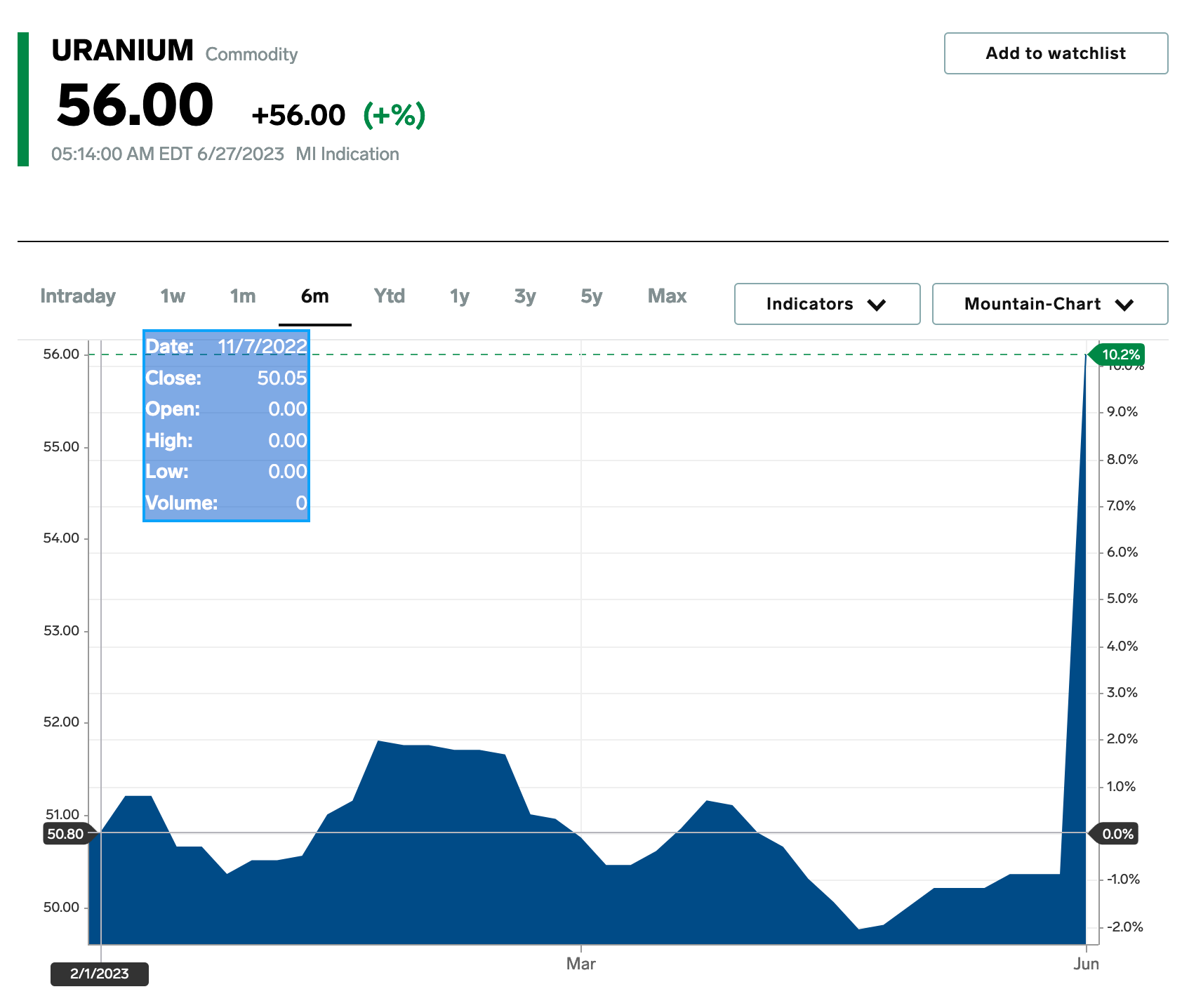
I’m just saying the graph is misleading because it changes the meaning of the X-axis significantly. In the screenshot it insinuates that it’s data of 6 months, but 95% of the graph is the first 3 months and the last 3 months for some reason are squized into the last 5% which makes it look like it was a spike over night as if something happened yesterday. Instead it might have been a gradual increase over the last 3 months, we don’t know because they have only one data point for the last 3 months while thy have 37 data points for the first 3 months of the graph.
I don’t know why they chose to arrange the data like that in the graph, but the relevance here is that Niger just said that they’re no longer going to export uranium to France where something like 75% of energy production comes from nuclear energy and Niger was one of the main suppliers.