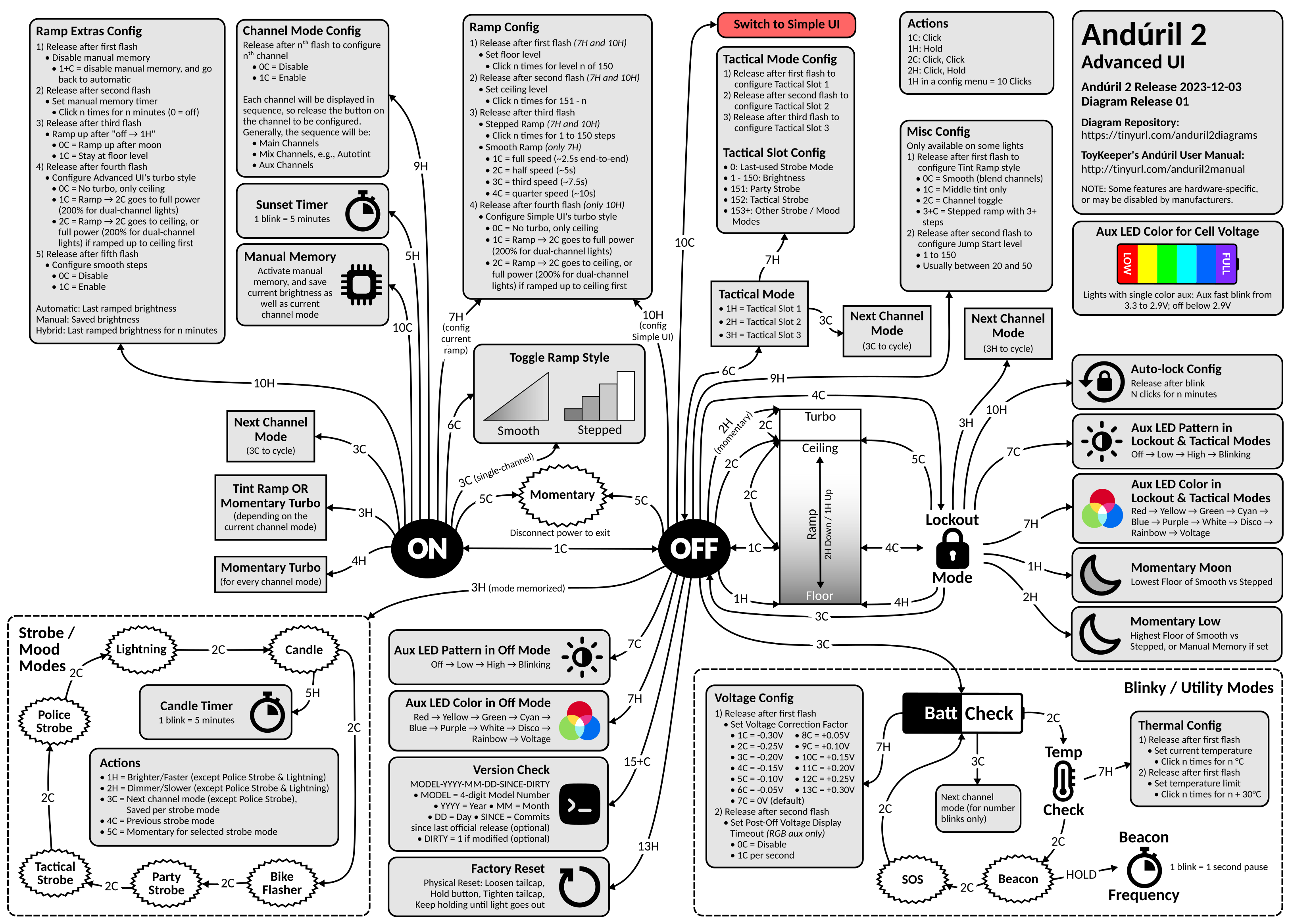
Advanced UI

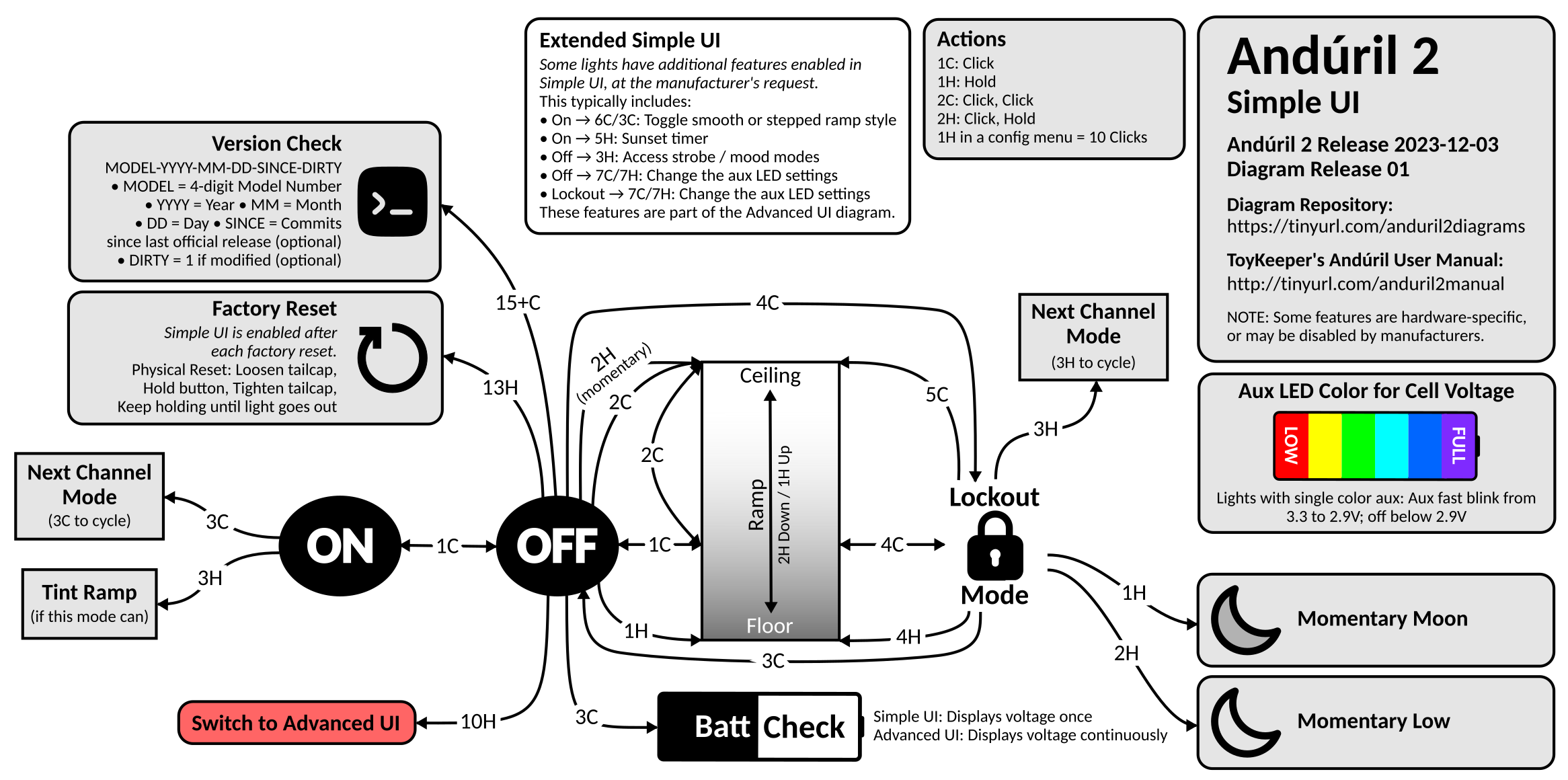
Simple UI
Background: This was 100% inspired by Lux-Perpetua’s Andúril 2 UI diagram on BLF. In fact, Lux’s diagram is so good, that I would have been happy to just use it except for one thing: the source isn’t published, so you can’t modify it. I also wanted to be able to keep it up to date with u/ToyKeeper’s code. So I created my own…
This is where I intend to store all of my Anduril 2 UI diagrams, and any updates to them. Since ToyKeeper split off the multi-channel version of Anduril 2, I have created two new diagrams for it:
Anduril 2 Multi-Channel Advanced UI (PNG)Anduril 2 Multi-Channel Simple UI (PNG)
Diagrams now hosted on GitHub.
Yeah, it got complicated enough that I could no longer fit the Advanced and Simple UI diagrams on a single page, so I had to split them.
As always, you are free to do whatever you want with these diagrams. I make these for myself, and I’m happy to share them with the community. You can find the source MS Visio file here. Feel free to make your own copy and modify it to your heart’s content. The Visio file contains several pages:
Single-Channel - Advanced/Simple UI diagram for the single-channel version of Anduril 2. I still need to update and post it.Multi-Simple - Simple UI diagram for the multi-channel version of Anduril 2.Multi-Advanced - Advanced UI diagram for the multi-channel version of Anduril 2.Diagram Parts - Various bits and pieces that I use in the various UI diagrams.
If you find any errors, please post a comment here. I try to keep the diagrams as accurate and up-to-date as possible, but you know, life happens. Enjoy!
Updates:
- 2023-07-06: Fixed several issues pointed out here. Thanks @lowprofile!
- 2023-07-09: Fixed a few more issues pointed out here. Thanks again @lowprofile! Also trying to get the wording in a few places more inline with the text manual.
- 2023-07-15: Updated for r728 which added channels for red, yellow, green, cyan, blue, purple, and white. Added 4H from ON to Momentary Turbo. Added 3C from Tactical Mode to Next Channel Mode. Several other minor fixes. Huge thanks to @lowprofile for continuing to provide valuable feedback. This multi-channel diagram has been a journey!
- 2023-07-17: Multiple visual enhancements/fixes thanks to @lowprofile. Incremented the version to r732 even though there were no material impacts to the diagram.
- 2023-07-20: Modified the ramp part of the diagram to reflect the default Anduril 2 configuration (2C to Ceiling). Thanks again to @lowprofile for feedback. I also switch from revisions to build dates as suggested by ToyKeeper.
- 2023-07-22: Made several corrections to the Simple UI diagram that I had been neglecting. Also made a slight wording change to the ramp config boxed on the Advanced UI diagram. Thanks to @lowprofile for all corrections. Finally, I incremented the build date to 2023-07-21, although there were no material impacts to the diagrams.
- 2023-08-06: Several cosmetic fixes to the Simple and Advanced UI diagrams thanks to feed back from @lowprofile. Also incremented the build date to 2023-08-04, although there were no material impacts to the diagrams.
- 2023-08-07: Several clarifications thanks to feedback from @lowprofile. Also incremented the build date to 2023-08-07, although there were no material impacts to the diagrams.
- 2023-08-10: Several cosmetic fixes to the Simple and Advanced UI diagrams thanks to feed back from @lowprofile.
- 2023-10-03: I’m embarrassed to admit that I missed an update from the 2023-08-27 release in which “smooth steps” were added (see the Ramp Extras Config). Other than that, there have been no material changes to the diagrams.
- 2023-11-07: I finally got around to making a couple of updates suggested by @lowprofile. In the Strobe Modes on the Advanced UI diagram, you’ll notice that 3C allows you to save the channel mode per strobe mode. Very cool!
- 2024-01-01: Last update here on Lemmy. Lemmy is great, but it makes more sense to host the diagrams on GitHub when I can issue diagram releases corresponding with ToyKeeper’s Anduril 2 releases. From now on, please access the diagrams there. It’s a fairly significant update, so please be sure to read the README.


Thanks for the update! I checked the new PDF version, and I have to say that I am still not convinced.
The frame is gone now, which is good, but the diagram size appears to have remained the same. Simple UI is still quite small and located in the upper right corner only, just as you stated, but also Advanced UI is (still) not centered on the page, but is located somewhat low; this results in not being able to have it scaled to the largest possible size when printing.
I guess that both diagrams would need to be scaled to and centered on the respective page in MS Visio before exporting/printing as PDF. Maybe the PDF format is not a strength of MS Visio in general? In any event, this probably would require an extra effort with each new diagram revision, depending on how MS Visio is handling this.
Furthermore, the graphic elements in the PDF version appear smoother on-screen now, but when printed, they still look pixelated, actually more pixelated than in the printed PNG version.
So, for the time being, I would still suggest to keep on going with the established PNG files exclusively.
Yes, maybe if I had Adobe Acrobat Professional, I might be able to produce high-quality PDFs. But the cost is insane, and I just haven’t had a need for it. Perhaps I’ll have better results if I can ever get the diagrams switched over to an open-source alternative for Visio.