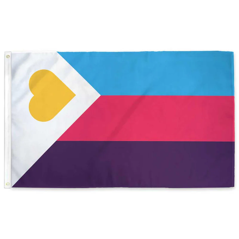
I really don’t like the design of the progress pride flag, and I couldn’t really put my finger on it until I saw this: https://nava.org/good-flag-bad-flag
For reference, here is the flag I’m referencing as “bad flag”:

And here is the original:

So, the original has too many colors, but it’s the colors of the rainbow. In order. It’s recognizable from really far away, and it’s dead simple to draw.
With the Intersex flag, that’s 14 colors. There are three shades of “purple”. The circle won’t be visible from far away. The chevrons are too thin to be very recognizable from far away.
It’s not like there aren’t good pride flags. Like there are AMAZING ones:


Edit:
In case you don’t know what these are: https://flagsforgood.com/collections/pride-flags


It’s the same phenomenon as “LGBTQI+”
It was literally LGB at one point. I understand the concept of inclusion but I think pursuing it by appending and appending and appending is a lousy way to go. I believe the “Q” was finally added in part because it was hoped to be some kind of catch-all, but that didn’t work.
We could always use the GRSM acronym (Gender, Romantic, and Sexual Minorities)
Oh shit I unironically like this.
I’m a fan of it but it doesn’t seem widely known. Maybe we should spread the word.
I propose reducing it down to QT
You have reached enlightenment. The universe has no more secrets to you, young one.
You know too much.
CATCH THEM, BOYS !
Maybe we should shorten it to Q++ 😅 (j/k)