I really don’t like the design of the progress pride flag, and I couldn’t really put my finger on it until I saw this: https://nava.org/good-flag-bad-flag
For reference, here is the flag I’m referencing as “bad flag”:

And here is the original:

So, the original has too many colors, but it’s the colors of the rainbow. In order. It’s recognizable from really far away, and it’s dead simple to draw.
With the Intersex flag, that’s 14 colors. There are three shades of “purple”. The circle won’t be visible from far away. The chevrons are too thin to be very recognizable from far away.
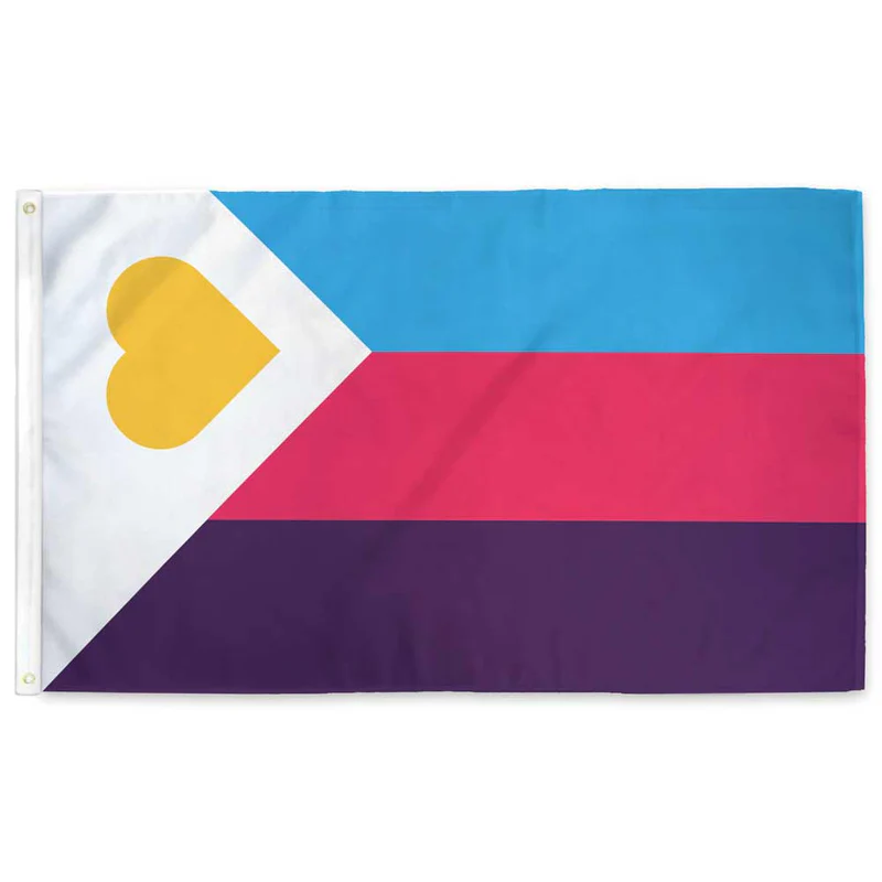
It’s not like there aren’t good pride flags. Like there are AMAZING ones:


Edit:
In case you don’t know what these are: https://flagsforgood.com/collections/pride-flags


Wasn’t the entire idea of the rainbow flag to just say “this includes everyone”, to be inclusive?
Then people started “well red is this, yellow is that, green is that …” Making the entire thing as exclusive as can be, now requiring a color and or symbol for each and every tiny different identity they were trying to be
But the stripes always meant something:
Hot pink = Sex
Red = Life
Orange = Healing
Yellow = Sunlight
Green = Nature
Turquoise = Magic/Art
Indigo = Serenity
Violet = Spirit
Flags being symbolic was never the issue. The progress flag was made in lieu of black, trans, and intersex queer USAmericans being excluded from big, corporate backed, pride events, which brought to the fore, a slew of intra-queer tensions.
By making this new flag, it was a way of symbolically coming together. And it’s stuck around because of, well… Everything going on lately.