I really don’t like the design of the progress pride flag, and I couldn’t really put my finger on it until I saw this: https://nava.org/good-flag-bad-flag
For reference, here is the flag I’m referencing as “bad flag”:

And here is the original:

So, the original has too many colors, but it’s the colors of the rainbow. In order. It’s recognizable from really far away, and it’s dead simple to draw.
With the Intersex flag, that’s 14 colors. There are three shades of “purple”. The circle won’t be visible from far away. The chevrons are too thin to be very recognizable from far away.
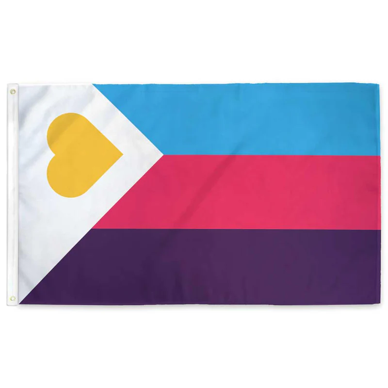
It’s not like there aren’t good pride flags. Like there are AMAZING ones:


Edit:
In case you don’t know what these are: https://flagsforgood.com/collections/pride-flags


Here’s the thing though, I know this is an ally flag, but it’s like they never considered symbols:
Ignore the really bad black and white background for a second.
Imagine the left side of the shape is an homage to the original pride flag and the right side is WHATEVER YOU WANT TO PUT IN IT. Uniform clean design with representation. Easy to draw for the layman (fill both sides in with rainbow if you want), and easy to add specific representation