
- cross-posted to:
- hackernews@lemmy.bestiver.se

- cross-posted to:
- hackernews@lemmy.bestiver.se
You must log in or # to comment.
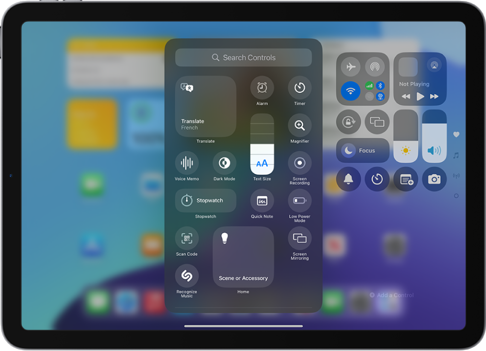
Running iOS developer beta here. No mi gusta.

LFMAO blur radius needs to be lots higher
Agreed. It just looks so busy with all of the background details.
I guess that’s the flaw with this design language. It looks kinda cool, but the effect is not very pronounced unless there are clear background details for it to do its whole refraction thing over. But then when there’s too much background detail, it makes the actual foreground interface harder to read.
I don’t hate it per se, but I think it’s just an unnecessary step backwards from the design languages popular today. But what I know I’m really going to hate is that now everyone is going to be trying to copy Apple’s design language, and we are teetering back towards the bubbly, glossy, skeuomorphic design of Frutiger Aero from the mid 00’s.
As some one who dœsn’t particularly care for frutiger æro , I at least hope peops do some thing (new|original) with this glass effect
Wonder what it’d lꝏk like if they still mimicked how glass worked in real life but used some thing like frosted glass for it for elements where readability’s important . Can maybe see tiny bits of refraction here :
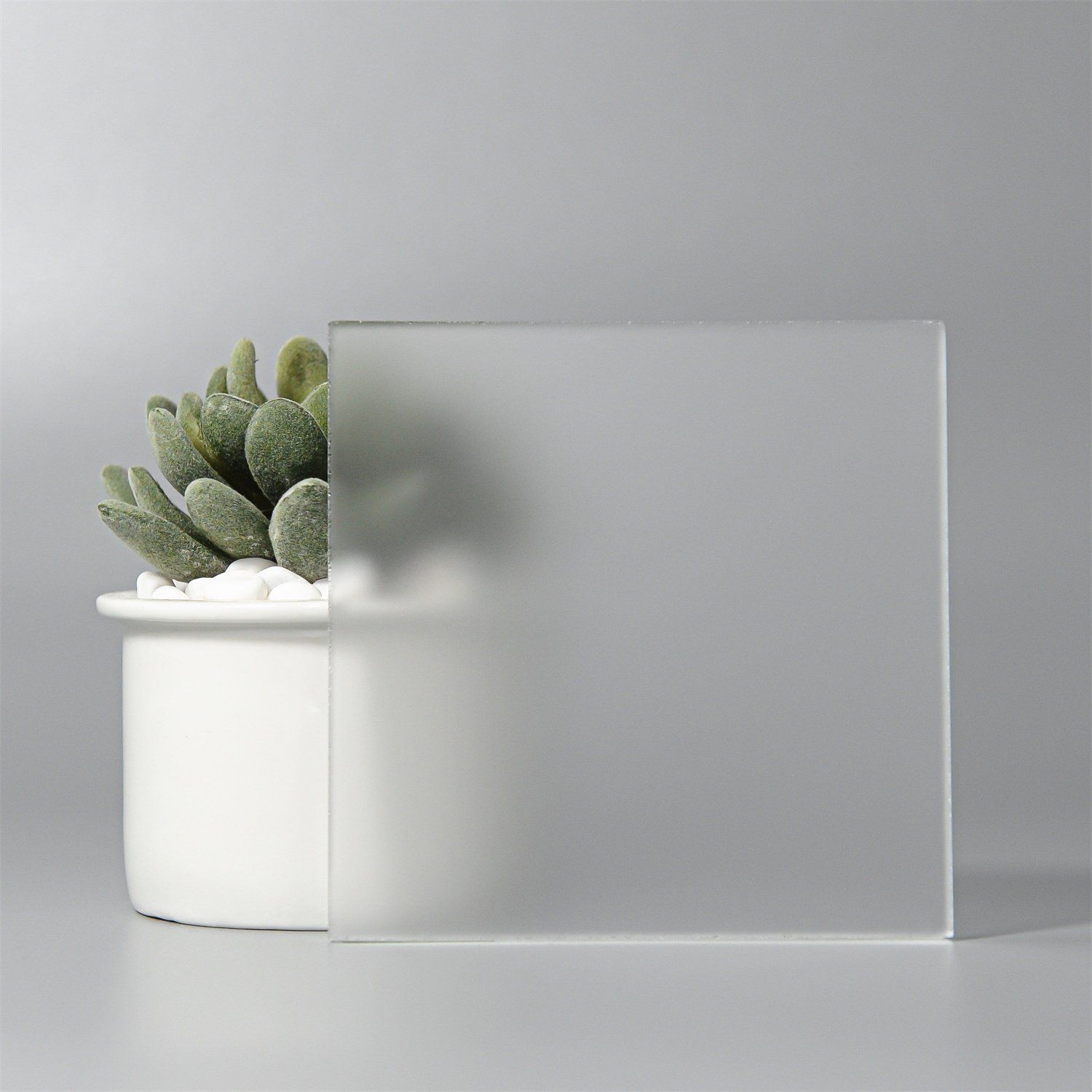
That looks closer to where things are today, with a lot of mainstream UIs that aren’t quite superflat going for that frosted, acrylic sort of aesthetic. Translucent but not transparent.
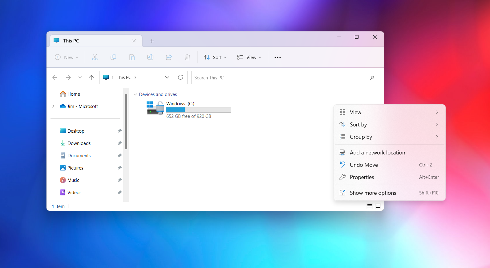
Examples from Windows 11 and iOS 18:
See also some of the transparency and active transparency in KDE 5 (and friends): https://discuss.kde.org/t/krusader-and-kvantum-transparency/17533
WIN10 ACRYLIC MENTIONED
…used before they frankensteined in the fluent around win11’s rollout 😔
Oh man that looks bad. Hopefully that’s like something going wrong in the beta version because I can’t see them shipping something that looks like that
The UI elements are totally working as designed, but they’re 100% going to need to change the blur and opacity. This is embarrassing.
It’s not embarrassing, it’s a beta. This will 100% get better over the months. It always does.
This makes me nauseous
sorry buddy but it’s “me” not “mi”…
Protip: if you requested the 26 beta and are regretting that rash decision… Reboot, then hop back into update settings and change it back to off. Thankfully, it resets and now you can wait out the far more sensible 0.2 beta, where they’ve ironed out the crazy kinks.
I haven’t reverted, but for every other version of iOS I’ve ever used, reverting requires a full wipe and then a restore from an old backup that was made with the old OS.
Are you saying that you reverted from 26 and downloaded and installed iOS 18 from the cloud?
Edit: everything I’m seeing in the developer forums is telling me nothing has changed. Reverting is not as simple as changing that toggle. Once you change that toggle, you will be locked into db1 until a new public release drops… unless you wipe and install the 18.5 ipsw
Once you toggle and request an update to 26, it takes a while for it to download and do the actual install. During that period, you can stop the install with no damage using what I described. I did that on an iPhone.
I went ahead and did the update to 26 on an iPad and about half my daily driver apps are borked, especially when it comes to resizable windows under multitasking.
Once installed, the only way back is to to hard reset and restore from iCloud backups. Big pain. Here’s a guide on how to revert: https://www.redmondpie.com/how-to-downgrade-ios-26-beta-1-to-ios-18.5-guide/amp/
Gotcha. Yeah, if you stop the request while you’re downloading or preparing the install package, you can cancel and stick with current OS.
But once you hit install and your screen goes to the white Apple logo, you’re kind of in it. If you want to revert, you need to wipe and restore from an iOS 18 install package on your computer.
Ah crap, it just reminds me of Windows Vista.
Also, having buttons and controls on transparent backgrounds makes things harder to read / discern.
The the lock screen however is a nice Apple-esque touch.
The Windows Vista part of this is a complement. Software should be fun and colorful again. Apple’s design is lacking in color, but this feels like a step forward.
I also agree that throwing transparency everywhere is probably really bad for readability. I hope the high-contrast mode can correct for that.
should
I don’t get this part but it’s a matter of taste I guess.
Vista called and wants it’s ugly back
Well said lol
What the fuck are you talking about? Vista and especially 7 were the best looking windows versions, unlike the flat and dull metro design of 8-10.
I see this opinion more and more as Gen Z starts joining vintage PC spaces. I don’t know if I agree (well I do agree that windows 8 and 10 suck), I always set the theme to classic and turned off aero first thing when using vista/7
Probably because it’s what a lot of us grew up with. My childhood was dominated by XP and by the time I was a semi-regular PC user, 7 was the state of the art. I remember trying to make the XP installation on my old laptop look more like Vista.
I never liked the classic windows look. It’s so dull and grey.
Oof. It does not look good, especially pausing on videos and the rest of the video ui. Why change it from their current design? I think this current design is the best OS design out of any OS ever. Now they’re just wrecking it.
I want to lick it.
snozzberries taste like snozzberries.
I don’t hate it. It’s just not a priority that I was interested in. For instance maybe revert the Photos app to its old goodness, rather than its new crapness. Maybe even expand usage cases for the dynamic island, since they’ve had so much time to do so and seem to have lost interest.
I was just happy to see that they added a tab for albums to the Photos app. That was my biggest frustration.
Did we not try the liquid glass thing decades ago?
DuckDuckGo summary: “Liquid Glass is a new design language introduced by Apple for its operating systems, including iOS 26, which features a translucent and dynamic interface that adapts to content and lighting. This design aims to create a more unified and visually appealing experience across all Apple devices.”
I just want to know what happened with the other 6 iOS versions. They got lost on the way up!
Its moving to a calendar based naming scheme ig
It makes sense for me. Thanks!
Just switching to annual numbers and a uniform version number system for all their operating systems. iOS, iPadOS, tvOS, MacOS, visionOS, watchOS, HomePod, etc.
They should’ve done this years ago. They have too many damn operating systems and platforms now.
Reminds me of Project Looking Glass which was terrible compared to Compiz.
I think I remember running that on a Live CD that came with a Linux magazine.
Bloody hell I’m old.
Apple can suck my dick.
I wish they would just like talk about security vulnerabilities and just like privacy issues and like tech dystopia stuff when it comes to the Apple channel on the Fediverse. This to me just seems like an instance to just advertise. Like, I have no interest in Mac, whatsoever. Especially with Adobe and Pantone and all these fucking dick rags. I used to create art and I kind of do but I’ve switched gears and you know I just have no interest working with inside these ecosystems and also I don’t purchase things that were created in these ecosystems. Also, everybody keeps using this stuff, which is making everything look the same, which is not valuable. I ignore like virtually all marketing. I want what I want. There’s only so much innovation in certain areas, you know, and then you’re just like polishing a turd moving it around a little bit kicking it Smushing it it still a turd