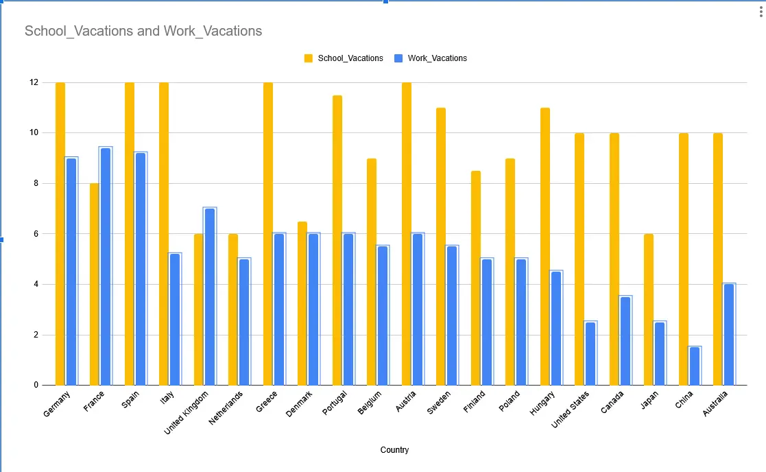
Why is there no label on the vertical axis. Are we talking days, seperate vacation periods (of different length) or percentage of days in a year? Oh there’s weeks in the title. Still a bad graph.
What does School_Vacations and Work_Vacations actually mean?
I was trying to have a working ai prompt to generate this via svg but they’re still so stupid .
Countries should have been colored according to the numbers in percentage


This is so bad.
It’s not a map.
Why is there no label on the vertical axis. Are we talking days, seperate vacation periods (of different length) or percentage of days in a year?
Oh there’s weeks in the title. Still a bad graph.What does School_Vacations and Work_Vacations actually mean?
I was trying to have a working ai prompt to generate this via svg but they’re still so stupid . Countries should have been colored according to the numbers in percentage
So you admit the plot is poorly done and still decided to share it here for some reason?!
Yes , for the idea, you know? Jee…