
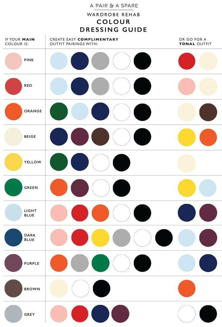
It’s not wrong, but I don’t know how helpful it is. I think it could be helpful for identifying complimentary colors, but it’s missing some context about which articles of clothing are which colors.
For example, it lists pink as a matching color for light blue. IMO, light blue pants with a pink shirt works fine, but a light blue shirt wouldn’t work so well with pink pants. In general you’d want your pants a darker color or cooler tone than your shirt.
(I usually stick to blue - white - brown, so really not an expert on colours)
These color combos look fine in general, I think it’s a good rule of thumb.
Can’t get past the comma splice.
Total and absoute pedantry. Complementary.
This is the first thing in awhile I’ve not seen load for me. I use Voyager. What apps are you guys using tk see whatever this graphic is?
EDIT: Seems to work for me now! Weird… Cool chart. It seems like it could be useful.
jerboa, no issues with images
I use the default web interface. Maybe it’s location-based? I’m in Europe
Are you in one of the countries or do you use one of the ISPs mentioned in Catbox’s FAQ under “Connectivity Issues”? https://catbox.moe/faq.php
Voyager (native app on Android) is loading the image just fine for me…
Most of these look good, green+orange and purple+orange and purple+green are all really rough without a lot of care though
Purple and orange seems pretty questionable, but the rest looks reasonable.

