
Purged voter count data by ZIP (Postal) code from the Ohio Secretary of State’s website (https://registrationreadiness.ohiosos.gov/#). Voting age population data is from the 2022 American Community Survey published by the US Census.
Context?
Without knowing how this compares to other states, which areas have higher counts of rental properties, how other states compare, and things like average or percentage of: ages, incomes, ethnicities, and probably party affiliation, this doesn’t tell us much by itself.
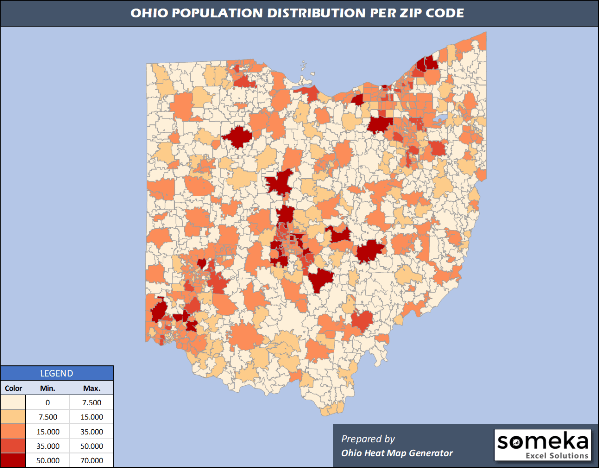
I am encouraged that it is given as a percentage of the voting population instead of a numeric count (XKCD’s pet peeve #208), but it still looks a lot like a population map. I had to find a straight population map to compare where it differs, and as a quick visual trend they are similar. From https://www.someka.net/blog/ohio-zip-code-map/ :
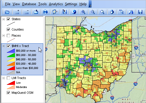
Overlap that with an income map (from https://proximityone.com/srdmi/ohdmi.htm):
With only a visual examination, I still have little idea of what the map says about voter purging. I can’t tell if old people are getting purged as they die, if college students are getting purged as they fail to change from their school address, or if a particular party is getting purged just to sway elections.
Only looking at northeast Ohio, the population and income maps you show are high along the Cleveland-Akron-Canton corridor, where the voter purge is west of there - Wooster & Mansfield.
OP, what information do you believe this map conveys?
by itself, it says very little than there are some (possibly) disproportionate impacts. As @memfree notes, there is a lot of overlap by population, but that doesn’t tell the whole story. There are some anomalies that need to be explored, and this map is just a preliminary analysis. Are there different living situations (e.g., prisons, long-term care facilities) whose populations are acting as a con-founder? I hope to keep exploring this.
There have been accusations that the purge process was conducted in a partisan manner, but there is little hard data to back up claims on either side. This work is an (initial) attempt to characterize who is impacted by looking at community demographics.
